Anatomy of Letters: Terms in Typography Every Designer Should Know
One of the most crucial elements of design is typography. It may influence a piece’s tone, emotion, and overall appearance and feel. While poor typography may make a design appear crowded and unprofessional, good typography can make it appear clean and polished. Hence, in design, it should never be an afterthought.
This article will take you through common typography terms concerning the anatomy of letters. It is important to know this as every term mentioned here affects your typeface’s overall design and work.
Type Anatomy
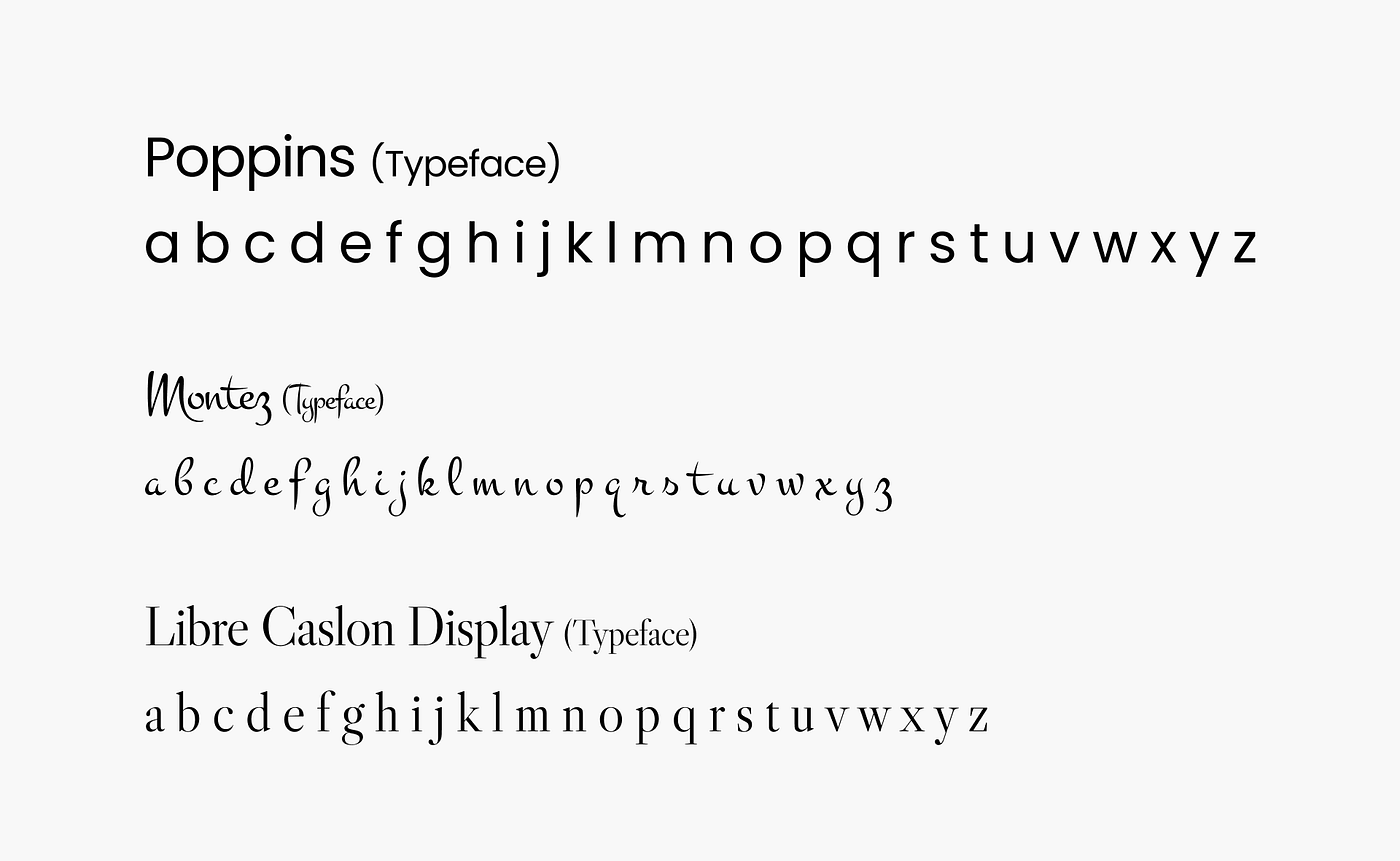
1. Typeface
Series of characters that are designed to belong together. Here are examples of typefaces:
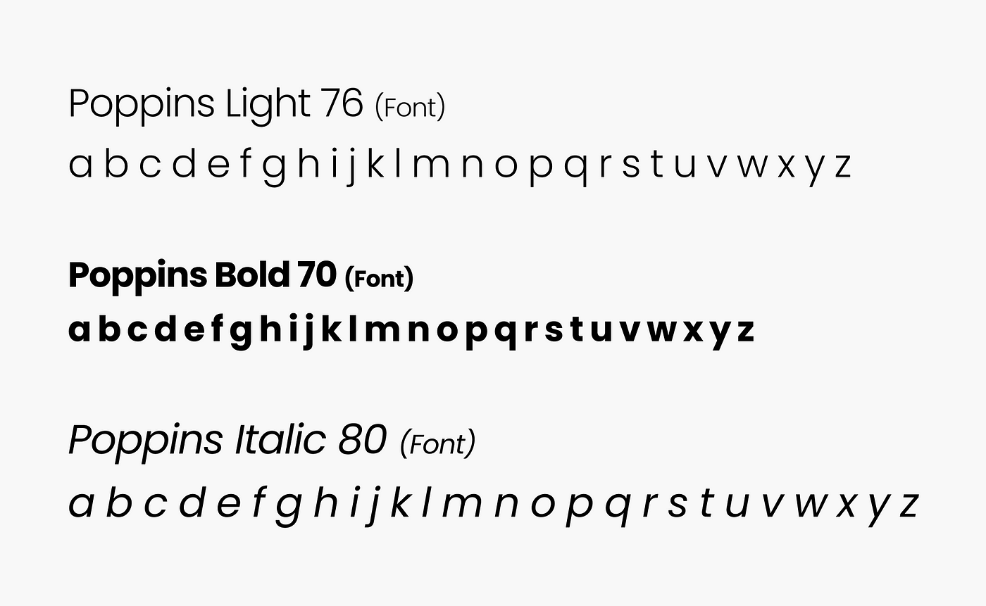
2. Font
It’s the use of a typeface, more like a typeface with specific characteristics defined, e.g the weight, size e.t.c From the example below, Poppins Light, Poppins Bold, and Poppins Italic are fonts.
It should be noted that typeface and font are different.
A typeface is letters with similar characteristics while fonts are typefaces with defined styles.
We can say fonts are chapters that make up a book while the book is a typeface, in music we can say typeface is the album while font is the individual songs that make up the album.
Below is Poppins Typeface with fonts varying in weight.

3. Baseline
This is the imaginary line where letters sit.
4. Capline
The imaginary line where the top of caps letters reach.We don’t consider the height of the lowerclass letters which simply overextend.
5. Meanline
The imaginary line where the top of vowels and body of lower class letters reach.
6. X-height
It is the height of the lowercase letter “x” in a given typeface. It determines how tall lowercase letters are in relation to uppercase letters. We can also say it’s the distance between the baseline and the meanline in a typeface.

7. Letter Forms
This is the design of one letter. This is the letter form of ‘b’ from Poppins.

Letter Parts
8. Ascender and Descender Strokes
Letters such as “g” and “y” have descender strokes that go below the baseline. This highlights the descender strokes of g and p:

Ascender strokes go up, away from the meanline like in the letters “l”, “t” and “d”. It is demonstrated in the highlighted parts below:

9. Stem
It’s the main vertical strokes of a letter.

10. Stroke
It’s the main diagonal strokes of a letter. They appear in some letters like in “z”.

11. Shoulder
The curve of a letter that extends beyond the vertical or main body of the letter.

12. Apex
The point at the top of an uppercase letter where two strokes meet.

13. Vertex
The point at the bottom of an uppercase letter where two strokes meet.

14. Counter
The space enclosed by lowercase letters or symbols.

15. Open Counter
The space partially enclosed by lowercase letters or symbols.

16. Serifs and Sans-serif
Serif is small projecting features at the end of strokes.

A typeface without serifs is called sans serif or sans-serif, from the French sans, meaning “without”.

17. Ligature
A ligature is a character consisting of two or more joined letters. The most common ligatures in English are “fi” and “fl”

Conclusion
Typography terms can be a lot and overwhelming, but you can start here.
Remember, it is essential to master the use of typography. Understand what you want to say, how you want to say it, and not from the words you’ll use but from the typography.
Thank you for reading :)